Why we built AppStage
We shipped the obvious version of a screenshot generator first. It worked, and the output was boring — competent, clean, and identical to everything else on the store. Fixing that turned out to be the product.
The first working version of this took a weekend. Scrape the app's listing, write a brief, hand it to a good image model, composite the real screenshot into a device frame. It ran end to end and produced six panels.
They were fine. Aligned, legible, correctly sized, consistent lighting. The first person who looked at them said they were very lame and boring.
That was the useful moment.
Nothing was broken
This is worth sitting with, because it is the trap the whole category is in. The output was not bad. There was no bug to fix, no prompt to lengthen, no model to swap. Every panel was a phone floating centred on a pale gradient with a headline above it — clean, professional, and interchangeable with several thousand other listings.
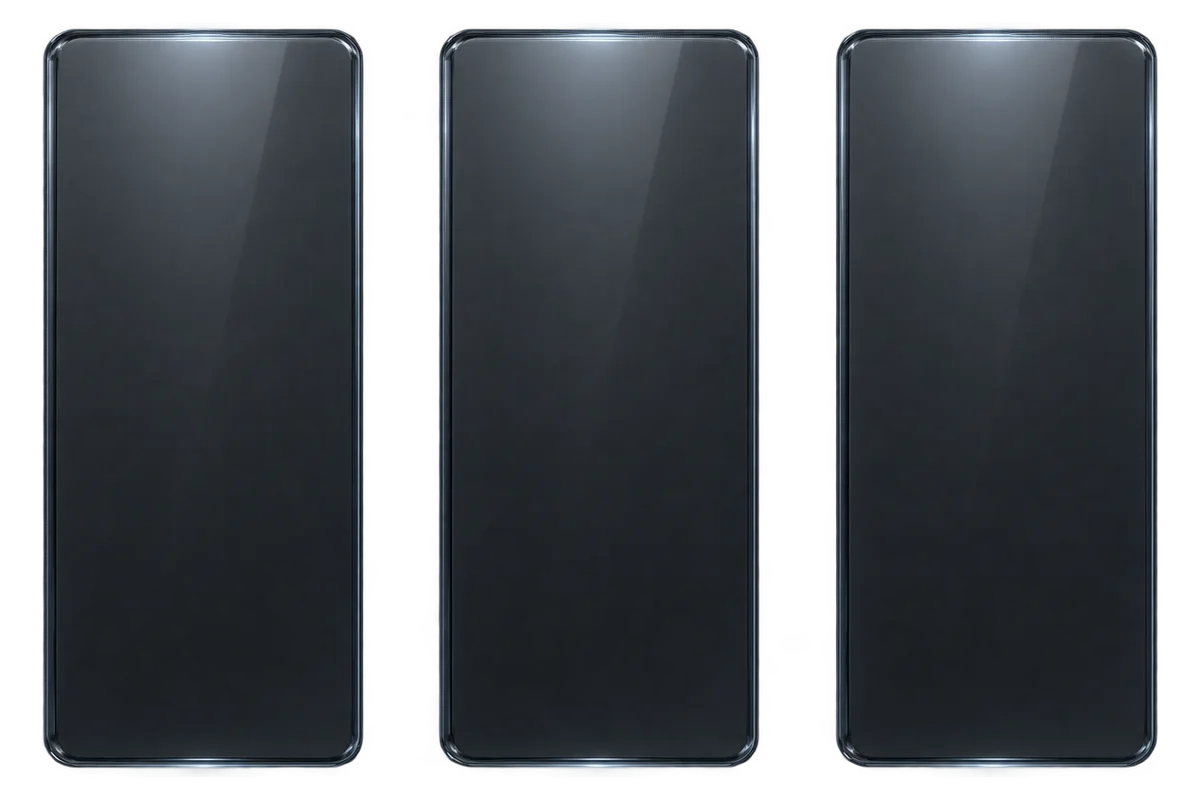
An image model, given an unconstrained brief, reaches for the safest composition it knows. Every tool built on one therefore converges on the same picture. That is not a quality problem you can solve with a better model, because the better model converges faster.
The fix was constraints, not prompting
What changed the output was making the boring composition unavailable:
- A set has to choose composition archetypes, and cannot repeat an arrangement across panels.
- A device cannot default to centred and upright.
- Panels are rendered together as one wide image and then cut, so lighting and palette match by construction rather than by luck.
- The screen inside the device is never regenerated. It is composited from your real screenshot, so the art direction can do whatever it likes to the surroundings without inventing a button your app does not have.
None of that is a prompt. It is code that refuses to produce certain output. That is the actual product — the image model is a component, and a replaceable one.
What we are not selling
We are not selling image generation. Anyone can wire a model to a phone mockup, several products already have, and you can recognise their output on the store. The thing worth paying for is whatever stops the result looking templated, and that turns out to be taste enforced in code rather than requested in a sentence.
The same logic is why there is no template library here. A template guarantees a floor, which is genuinely valuable — and it guarantees that everyone who uses it lands in the same place. We wrote the longer argument on the templates page.
What we refuse to do
Two rules that cost us features:
No invented numbers. No fabricated ratings, download counts, streaks or review quotes inside a device screen. Both stores treat that as misrepresentation, and the pipeline is built so it cannot produce one, even when it would look better.
No redrawn UI. Your screen is a photograph. If the model cannot reproduce it exactly, it does not get to touch it.
Both of these make some panels less pretty. They also mean a set you can actually ship.
Where we are
Honest version: early. The render pipeline, the canvas editor, Icon Studio and direct publishing to App Store Connect are built. Direct publishing to Google Play is not — you export files and upload them yourself. The changelog is the unvarnished record of what landed when, and the showcase is output from the real pipeline rather than mockups made for this site.
If your listing currently looks like everyone else's, that is the specific problem we set out to solve.
Keep reading
Best App Store screenshot tools in 2026
Six ways to produce a store listing, sorted by what you are actually optimizing for — speed, cost, control or distinctiveness. Including the cases where the right answer is not a tool at all.
Read ComparisonsCanva for App Store screenshots: where it breaks
Canva is the tool most people already have open, which makes it the default choice and often the wrong one. The three specific places store listings break it, and how to work around them if you stay.
Read GuidesHow to make App Store screenshots in 2026
The whole job end to end — capturing clean source frames, deciding what the first panel promises, designing the set, hitting exact dimensions, and testing whether any of it worked.
Read